How to Get in the Mood with Color
Age doesn’t matter when it comes to color. Choose your favorites and stick with what flatters your true self. The following color trends will give your wardrobe a youthful update.
The PANTONE Fashion Color Report provides a comprehensive overview of fashion designers’ use of color in their spring 2017 collections, as seen during New York Fashion Week. From colors that are bright and vivid to those that convey a sense of earthiness, Pantone sees the top 10 colors for this spring as reminiscent of the hues that surround us in nature. Featuring the top 10 shades seen on the runway, the PANTONE Fashion Color Report is your essential color guide to the season.

You will find these colors in stores as you shop for clothes. The descriptions below should help you to recognize similar colors that you may already have in your closet.
From the warmth of sunny days with Primrose Yellow to the coolness of pristine waters with the blue of Island Paradise, Pantone sees this spring’s colors as a mixture of vitality, relaxation and the great outdoors.
Greenery is the color of the year, according to the Pantone Color Institute. It is symbolic of what they see taking place in our global culture that serves as an expression of a mood and an attitude. The more submerged people are in modern life, the greater their innate craving to immerse themselves in the physical beauty and inherent unity of the natural world.
Each color has a mood. And when you clothe yourself in the color, its mood reflects upon you.

When you feel the need to be refreshed, wear Greenery:
A spring-like yellow-based green, which symbolizes new birth or new growth — the beginning of something, Greenery brings forth a refreshing take. It speaks to our need to explore, experiment and reinvent. Illustrative of flourishing foliage, the fertile attributes of Greenery signal one to take a deep breath and reinvigorate.
When you want to lay back and relax, wear Niagara:
- Comfortable and dependable, Niagara leads the PANTONE Fashion Color Report as the most prevalent color for spring 2017. Niagara is a classic denim-like blue that speaks to our desire for ease and relaxation. And it goes with everything, just like jeans.
When you want to brighten up your day, wear Primrose Yellow:
- Primrose Yellow sparkles with heat and vitality. Inviting us into its instant warmth, this joyful yellow shade takes us to a destination marked by enthusiasm, good cheer and sunny days.
When you need emotional energy, spirit and strength, wear Lapis Blue:
- Lapis Blue is strong and confident. Since this intense blue shade is imbued with an inner radiance, that feeling will reflect within you as well.
When you want to pump yourself up with enthusiasm, wear Flame:
- A red-based orange, Flame, is a bold and fun. Flamboyant and vivacious, this wonderfully theatrical shade adds fiery heat to the spring 2017 palette.
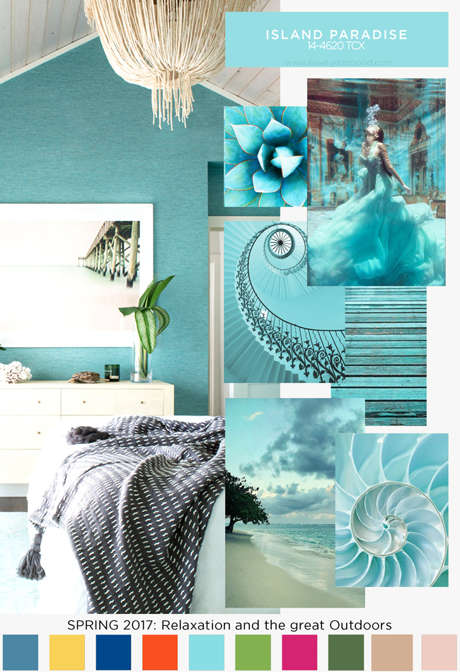
When you want to relax and when you want to create a great first impression (such as on a first date), wear the soft aqua of Island Paradise:
- Island Paradise is a refreshing aqua that calls to mind a vacation getaway. A cool blue green shade that speaks to our dream of the great escape, Island Paradise is emblematic of tropical settings and our desire to unwind.
When you want a sensual glow that is non-threatening, wear Pale Dogwood:
- For a tranquil mood, try Pale Dogwood. It is a quiet and peaceful pink shade that emits an aura of innocence and purity. The delicate Pale Dogwood is a subtle pink whose soft touch infuses a healthy glow.
When you want to feel feminine and glamorous, wear Pink Yarrow:
- Tropical and festive, Pink Yarrow is a whimsical hue that tempts and tantalizes. Bold, attention getting and tempestuous, the lively Pink Yarrow is a captivating and stimulating color that lifts spirits and gets the adrenaline going.
When you need some healing energy, wear Kale:
- Evocative of the great outdoors and a healthy lifestyle, Kale is another foliage-based green that conjures up our desire to connect to nature, similar to the more vivacious Greenery. And, just as we see in nature, this lush and fertile natural green shade provides the perfect complementary background to the more vibrant tones in the palette. And since it is a dark color, it also goes beautifully with whites.
When you need some grounding and want to feel down to earth, wear Hazelnut:
- Rounding out the spring 2017 colors is Hazelnut, a key neutral for spring. This shade brings to mind a natural earthiness. Unpretentious and with an inherent warmth, Hazelnut is a transitional color that effortlessly connects the seasons. Try mixing Hazelnut with purple, green, gray or Flame.
Do you put on a certain colors to make you feel better? Let us know how you work it! Enter your comment in the box below.
You might also like to read other posts in my Color Series HERE.
Do you have a friend who would like this? Please use the Share buttons.
Follow Your True Self Blog on Facebook, Instagram, Pinterest, Twitter and Bloglovin.


Well, as someone who’s been hooked on black for ages, my reasons were that my personality is more edgy than the softness of my features. I love the cool factor. Most women like black because it slims and it’s easy.
It seems you like the black, white and gray basics, which is a real good neutral base for a wardrobe. They go with just about everything; fear nothing as far as adding whatever color you want to that base.
But red is the perfect classic pop of color for black and white.
And turquoise is a color that works as a neutral and goes with everything, as does green and eggplant.
Blues make you feel calm and relaxed, or maybe you feel blue when you choose them?
Red stimulates and gives you energy and power.
White is purity and innocence, but black is powerful, calming and mature.
So choosing red and black means choosing power; choosing blue, black and white is reassuring and means you’re choosing calm.
Gray is subtle and soft, tempering the power; it’s in between the power and the calm that you seem to be balancing.
Now that you asked, I think I’ll write an article about what personality types choose which colors as their favorites.
Was this helpful? What do you think?
XO, Angie