It’s Time to Start Wearing the Spring/Summer 2026 Colors
At the beginning of spring, it’s still cold so we can’t just run outside in our shorts all of a sudden…although some people do anyways. That’s okay if they like to dive right in like that. But I like to stay cozy. It’s much warmer and easier to just start in on wearing spring colors. I’m writing this in time for the first day of spring, because I consider this the ideal time to start wearing the Spring/Summer 2026 colors.
Besides providing a mood and feeling, color is a basic component of our wardrobe. It can help everything to coordinate, creating a greater amount of outfits from what you have.
The Pantone Color Institute reports biannually on the fashion runway color trends, color psychology and more. This post presents their Spring/Summer 2026 color report from New York Fashion Week (NYFW.) Since these colors are trending, you will look modern when you wear them. Age doesn’t matter when you’ve got style!
However, classics have the most staying power. You can find my style tip on how to use the classic Spring colors now HERE. Also, the neutral colors within this season’s Pantone palette are always classics. You’ll find them following the top ten color chart below.
Pantone’s NYFW Spring/Summer 2026 Colors
This season’s featured colors by Pantone are being picked up by brands, so you should be able to find them easily when shopping. Below, I’ll show you the Spring 2026 colors from New York Fashion Week so you can get wearing them now, whether you already have them or you decide to add them to your wardrobe.
But first, here’s a bit of inspiration from the Pantone Color Institute experts:
…designers at NYFW Spring / Summer 2026 fearlessly step into personal expression, a dramatic bulwark against AI and creeping homogenization. Finding freedom to redefine color usage, this season’s palette contrasts warm familiar shades with more vibrant, stimulating colors and foundational tones.
“Celebrating self-expression and individualism, NYFW Spring/Summer 2026 gives us a very new way of putting colors together.” — Leatrice Eiseman, Executive Director of the Pantone Color Institute
Colors for Spring/Summer 2026 continue the drumbeat for honesty, authenticity and desire to put our own unique stamp on what we wear. The balance of colors that boldly celebrate the joyfulness of dressing with trans-seasonal neutrals and calming minimalist tones create new looks free from constraint.
From the quietly glamorous saturation of Alexandrite teal to the dramatic intensity of Lava Falls red, from the ethereal White Onyx to the balancing power of Sage Green, this combination of maximalist and minimalist colors signals fresh silhouettes, unconventional pairings and novel self-expression that showcases humanity in all its guises.
Here Are the NYFW Spring/Summer 2026 Colors
This special chart from Imagine You on Facebook shows which skin tone palette is flattered most by each color (out of the Winter, Spring, Summer and Fall palettes.) If you don’t know your best colors and would like to find out, see my post recommending an easy online color analysis HERE.


The Top Ten Standout Spring/Summer 2026 Colors from New York
Do you like the fancy names given to colors? I prefer to know the actual name such as blue, red or yellow! So for each Pantone color name, I describe the color. I believe that makes it easier to use what you have or choose your favorite hues in the stores that correspond to the Spring/Summer 2026 colors.

Acacia: a greenish yellow, like moss or lime

Marina: a marine blue, similar to cobalt

Muskmelon: melon color

Alexandrite: deep teal

Lava Falls: a deep, dark red

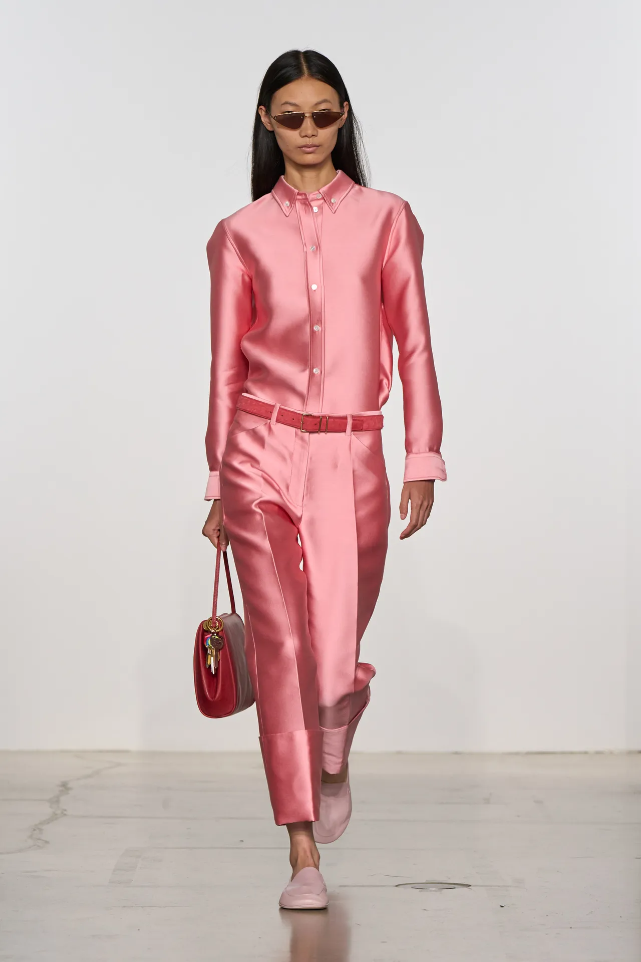
Dusty Rose: a soft, cool pink

Tea Rose: a red-toned pink

Amaranth: a deep, dark purple, similar to plum
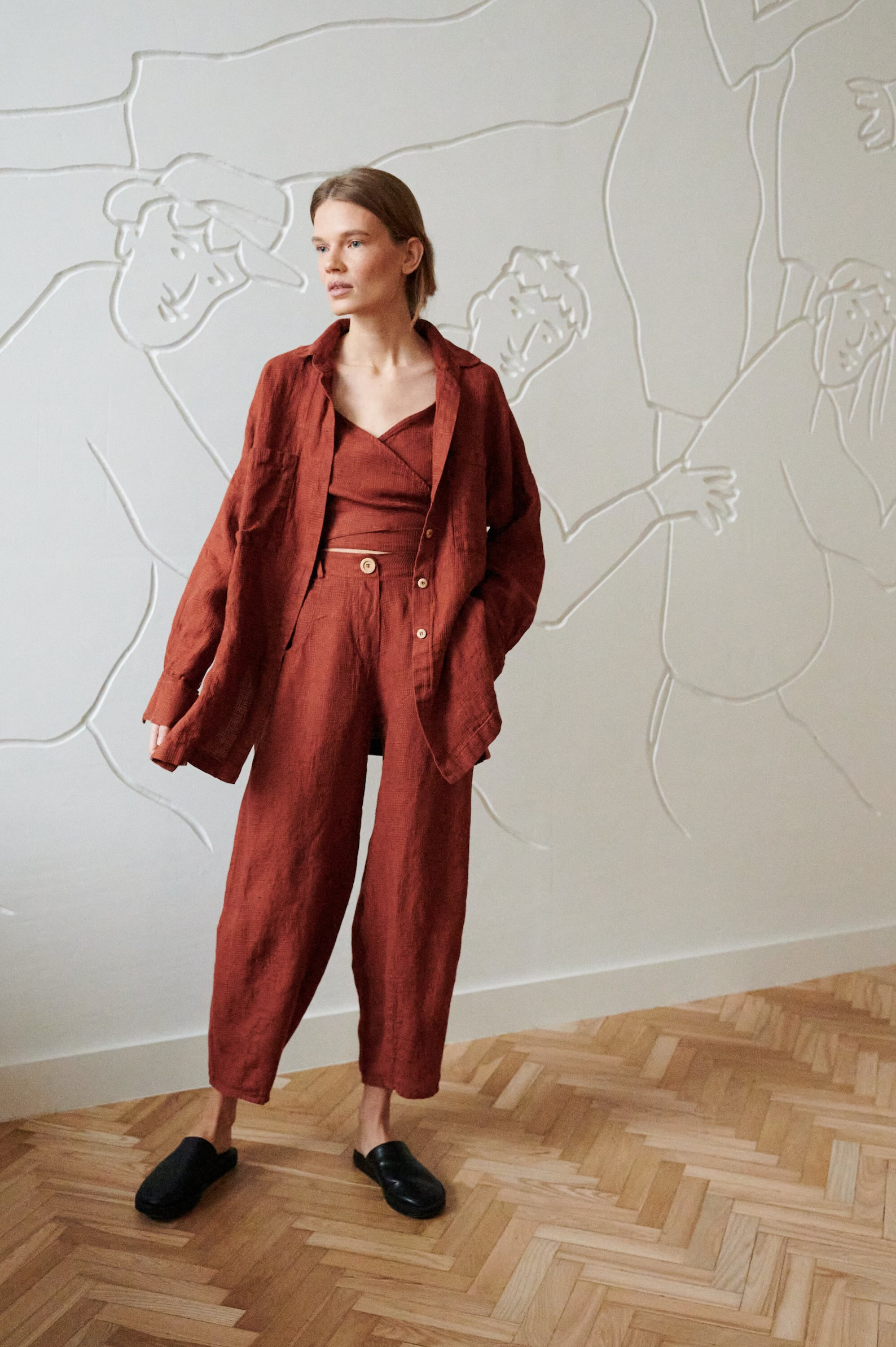
Burnt Sienna: russet red, similar to terra cotta or rust
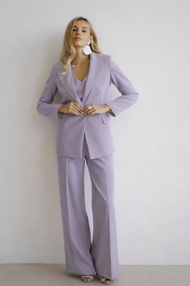
Burnished Lilac: smoky lavender
Seasonless Neutrals
Here’s what Spring’s classic and luxurious neutrals look like. They will give you a feeling of comfort and ease.

Coffee Bean: coffee color, a deep, dark brown
White Onyx: off-white

Rhodonite: a deep/dark blue

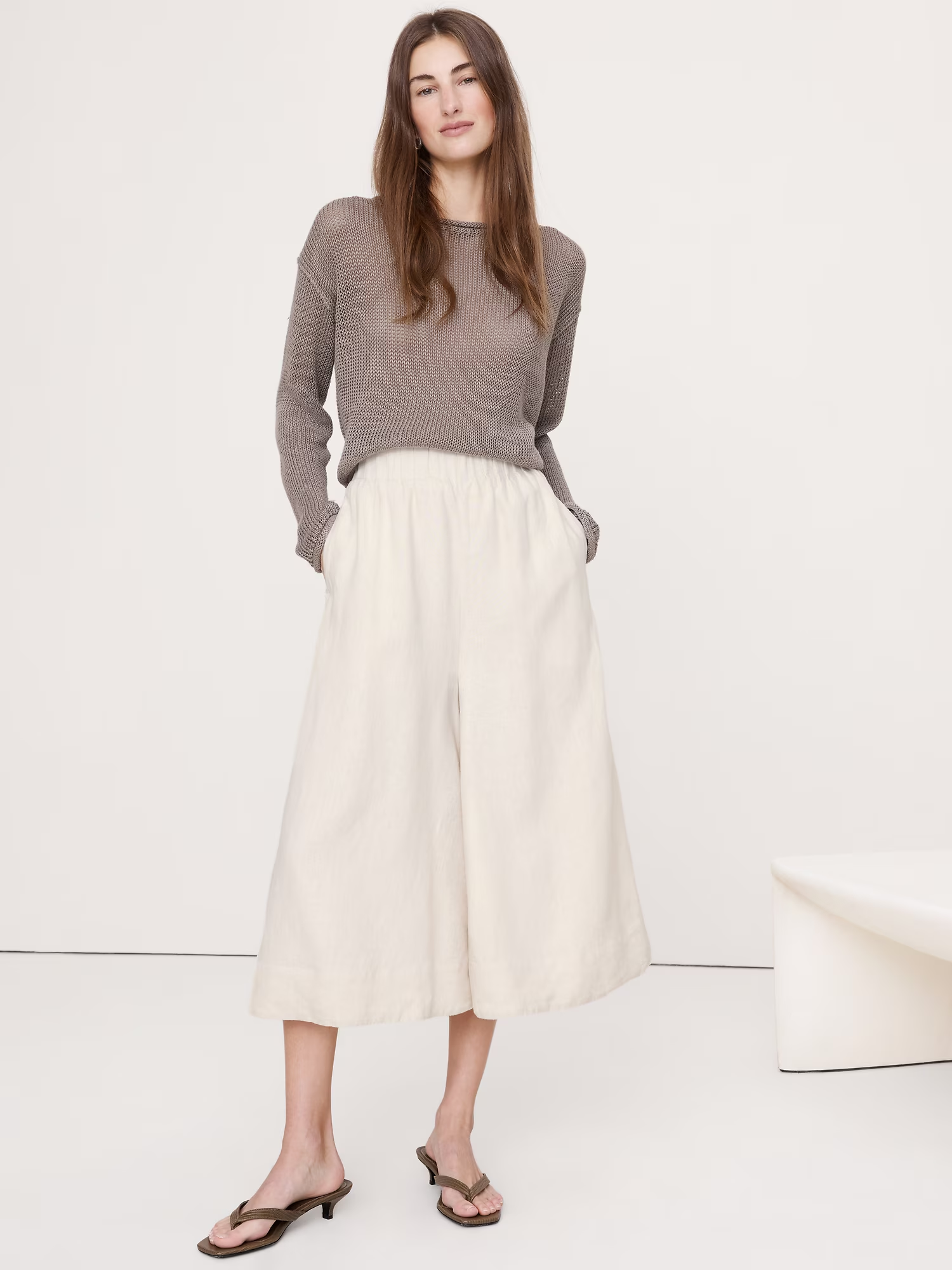
Angora: soft beige
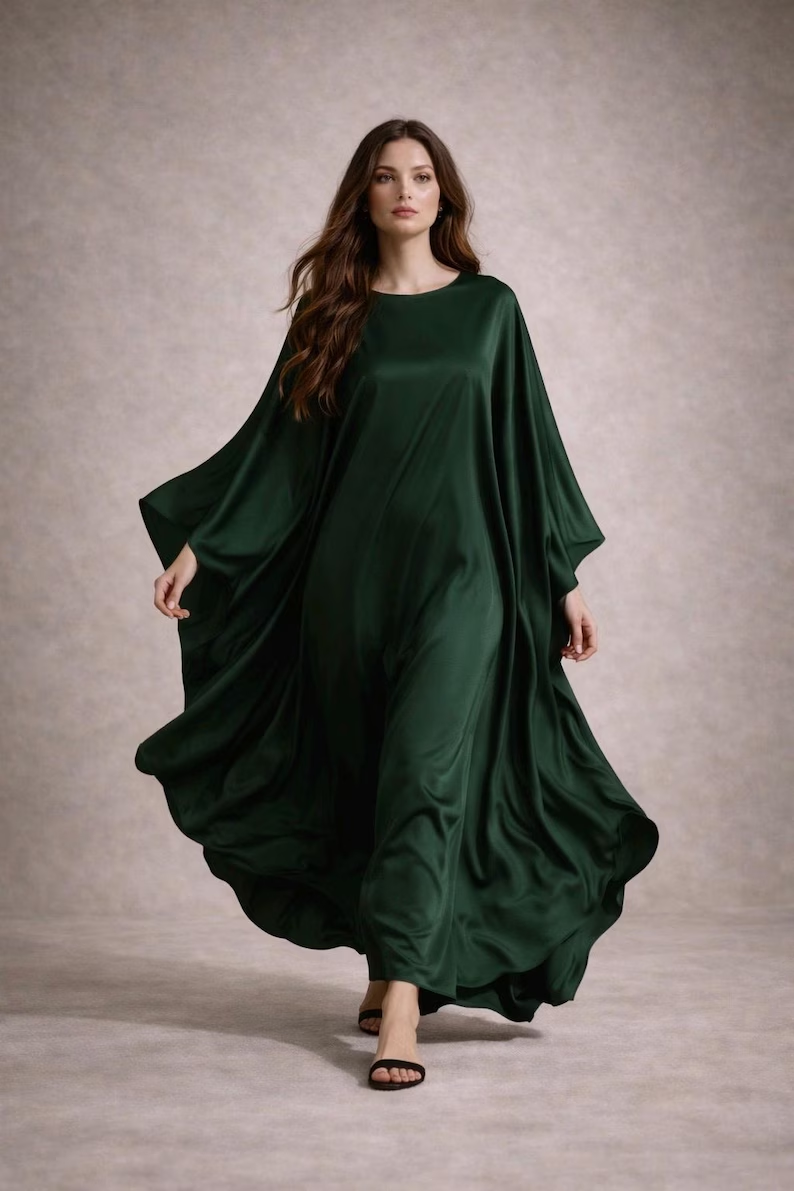
Sycamore: deep, forest green

Sage Green: a naturally soft, muted tone
Let’s Connect!
I hope this was helpful to you and that you get inspired with outfits for Spring using these colors. I would love to hear about it. Please leave a reply in the comments below!
Do you have a friend who would like this? Please use the Share buttons.
Never miss a post! Get new content each week by email. Send your request by clicking “Subscribe” in the form at top, or fill out the form for my newsletter on the right. That would be a great help in keeping this blog going. You can unsubscribe at any time with a simple click.
I now have a Shop page where you can purchase for a nominal price one of my Style Guides. Over time, I will add more and more. Please support Your True Self. Visit my Shop HERE. Or go to the top of this page and select the Shop tab. Thanks!
Please follow Your True Self Blog on Facebook, Instagram, Pinterest, Twitter and/or Bloglovin.
Thanks for visiting Your True Self Blog!
Angie


I think I could wear many of these colors. I love that lime cream top from Etsy!
https://marshainthemiddle.com/
Great pick, Marsha, that shirt really is beautiful…and definitely more affordable than the other examples. But these photos are just to help you visualize how these colors will look and decide which you want to wear this Spring and Summer. I hope you’ll feel the mood of the warm season with these.
Very exiting colours especially that Max Mara outfit in green!
That outfit is in mint green. And yes, the outfit is absolutely stunning, isn’t it? Green is being shown in all its glory this Spring and Summer, it seems. Thanks for sharing your reaction!