The New Colors for Spring/Summer and How to Wear Them
Spring brings with it brighter, lighter clothes. This is the time to start choosing spring colors to really get into the mood of the season. This post contains the new colors for spring/summer and how to wear them.
I like to start wearing spring colors from the first day of the season until the last. That’s why I am posting these colors now instead of when they were first announced in the fall!
The Pantone Fashion Color Report provides a comprehensive overview of fashion designers’ use of color in their collections. The color palette shown here is based on New York Fashion Week Spring/Summer 2022. The trending colors are generally available in the stores, so they should be fairly easy to find. You may also have these colors in your wardrobe already. Updating your colors keeps your look modern. Age doesn’t matter. And remember, older is bolder! This year’s palette gives you the option of piling on the bold colors.
I will recommend which are the best for your coloring, below the color swatches. If warm spring or autumn colors look best on you or if cool summer or winter colors are your best, read my summary located below the color swatches.
And finally, I will include ideas for some of the best ways of combining the Pantone colors together. You’ll find that at the bottom of this post.
Color of the Year 2022

Pantone created a new shade of periwinkle to feature as the Color of the Year. They are calling it Very Peri, a periwinkle blue. But all shades of periwinkle, lavender and light-to-medium purple are appearing in stores and on Pinterest. So feel free to choose your best shade of purple to enjoy in your home as well as in your outfits. Inspired by the vivid violet blues of the digital world, Very Peri was chosen to inspire our creative spirit, opening us up to a new vision as we rewrite our lives. For more about Very Peri, see my post “How to Use the Color of the Year With Other Colors for the Most Outfits” HERE.
Spring/Summer 2021 Color Palette
“Colors for Spring 2022 bring together our competing desires for comforting familiarity and joyful adventure through a range of soothing and timeless colors, along with joyous hues that celebrate playfulness. As we enter this new landscape, one where fashion rules no longer apply, hues for Spring 2022 allow us to mix and marry as we please, encouraging the exploration of new chromatic realities, opening the door for personalized style and spontaneous color statements,” said Leatrice Eiseman, Executive Director of the Pantone Color Institute.
Here are color swatches from Pantone’s NY Fashion Week Spring/Summer 2022 Color Trend Report. When you’re out shopping, you might like to pull these color swatches up on your cell phone to see if they match the colors you see in the stores.
“Diverse and distinctive colors come together to create a palette blending comfort and familiarity with unexpected delight.” — Pantone

THE SPRING/SUMMER 2021 CORE CLASSICS:
The classic colors are above (Snow White, Perfectly Pale, Basil, Northern Droplet and Poppy Seed.) These are core hues whose versatility transcends the seasons and allows for more freedom of choice. They are designed to go with any of the trending colors, as well as with each other.
The Colors That Will Flatter Your Personal Coloring
- If Warm Colors Are Your Best: Gossamer Pink, Innuendo, Daffodil, Coca Mocha, Dahlia, Poinciana, Perfectly Pale and Basil
- If Cool Colors Are Your Best: Glacier Lake, Harbor Blue, Northern Droplet and Snow White
- Universal Colors (looks good on everyone): Skydiver and Spun Sugar
Pantone Spring/Summer 2022 Color Combinations
As stated above, the core colors of this season’s palette are designed to go with any of the trending colors as well as with each other. For your convenience, I’ll repeat the core colors here: Snow White, Perfectly Pale (sandy beige,) Basil (or khaki green), Northern Droplet (pale gray) and Poppy Seed (deep charcoal gray.)
The color combinations listed here are not the only possibilities; they’re just a few ideas. Definitely go beyond the Pantone palette to other colors and shades. Also, remember that any color goes with denim or animal print. To get you started combining the Pantone Spring colors, try some of these:
- Very Peri + Harbor Blue, mint green or lemon yellow (for more color combinations, see my post on How to Use the Color of the Year With Other Colors HERE.)

Sweater by Hellessy in Spun Sugar with Basil pants and Innuendo shoes - Spun Sugar (pale blue) + a shade of Very Peri, Glacier Lake, Skydiver, Coca Mocha, Daffodil, Gossamer Pink, Basil
- Daffodil (yellow) + Coca Mocha, Skydiver, Spun Sugar, Glacier Lake, Dahlia, Basil, Snow White
- Gossamer (pale) Pink + a shade of Very Peri, Innuendo, Daffodil, Spun Sugar, Dahlia, Snow White, Northern Droplet, Basil

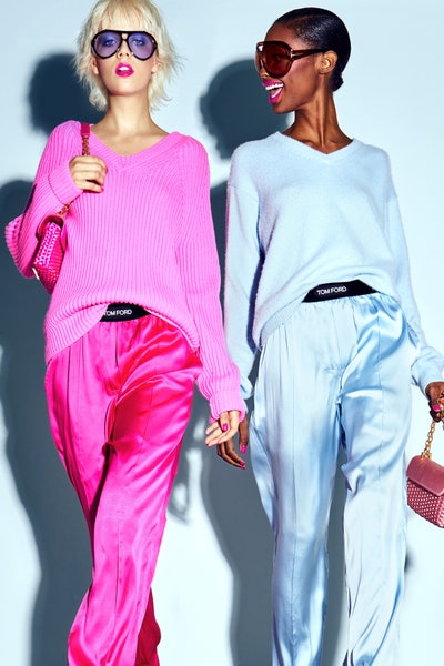
Linda Helena wearing Tom Ford Spring 2022 Ready-to-Wear at Vogue, photo by Filippo Fior - Innuendo (bright pink) + a shade of Very Peri, Gossamer Pink, Daffodil, Glacier Lake, Dahlia, Snow White, Poppy Seed
- Glacier Lake (icy blue) + a shade of Very Peri, Innuendo (bright pink), Daffodil, Skydiver, Coca Mocha, Perfectly Pale (sandy beige)
- Harbor Blue (cool teal green) + Innuendo, Poinciana, Skydiver, Dahlia, other blues
- Skydiver (blue) + Very Peri, Daffodil, Poinciana, Gossamer Pink, Snow White, Northern Droplet, Poppy Seed, other blues
- Coca Mocha + Spun Sugar, Harbor Blue, Daffodil, Perfectly Pale (sandy beige)
- Dahlia (vibrant purple) + Very Peri (in a shade of lavender), Harbor Blue, Gossamer Pink, Daffodil, Northern Droplet, Poppy Seed, Coca Mocha, Basil, Poppy Seed
- Poinciana (bright red) + Skydiver, Dahlia, Innuendo, Daffodil, Poppy Seed, Basil, Poppy Seed, Northern Droplet, Perfectly Pale (sandy beige)


Ways to Wear Spring/Summer 2022 Colors
Here are a few outfit suggestions based on these colors:
- White tee + jeans + a scarf or topper of any bright Pantone 2022 color or print containing the color/colors.
- A column of Poppy Seed (top and bottom, or a dress) + a Burnt Coral topper or scarf. You may even want to add shoes in Burnt Coral.
- A leopard-print top or topper + Coca Mocha bottoms.
- A Poinciana top + animal-print bottoms.
- Monochrome: wear an outfit based on one of the Pantone 2022 colors in different shades.

Red Open-knit shirt from Bottega Veneta at Net-a-Porter with bold blue pants and sand-color shoes - A top in any of the Pantone trending colors above + Poppy Seed, Northern Droplet gray or denim bottoms. You might like to add gray footwear.
- A top in Perfectly Pale (sandy beige) + Basil or Coca Mocha bottoms. Add a jean jacket + accessories in any of the trending Pantone colors.
- A Daffodil/yellow top + Poppy Seed or Northern Droplet gray pants or skirt. You might like to add gray footwear.
- A linen top in Coca Mocha or Perfectly Pale (sandy beige) + Basil green or khaki green bottoms.
Let’s Connect!
What do you think about my color choices for each seasonal palette? How about my wild color combinations? Let me know if you agree or have other ideas. I would really like for you to leave a comment below!
Like this post? You might also like to read:
- “How to Easily Chart Out Colorful Outfits”
- “How to Get a Sleek and Interesting Monochromatic Look”
- and more in my Color Series HERE.
Do you have a friend who would like this? Please use the Share buttons.
Never miss a post! Click “Subscribe” in the drop-down at top or fill in the blanks for the “Newsletter” at right. That would be a great help in supporting my blog. I would appreciate it very much!
Visit my Shop for Style Guides HERE. Or go to the top of this page and select the Shop tab.
You can follow Your True Self Blog on Facebook, Instagram, Pinterest, Twitter and Bloglovin.
This post is linked up with Link Up on the Edge #288 at Shelbee on the Edge.
Thank you for visiting Your True Self Blog!
Angie


Turn on the brights! Lovely shades! Although, I do like pattern-mixing, I’m not fond of the pattern-mixed outfit shown here. It clashes too much in my opinion.
❤️carmen
I love the way that Ralph Lauren mixed a plaid shirt with a printed skirt. It IS a wild print on that skirt. But both the shirt and skirt have blue and white in them to join them together. I’ve just always been kind of adventurous, I guess. I’m not surprised you love the bright colors because they signal the warm weather and clothes that you prefer. Thanks so much for stopping by!
I love some of those cool shades and hope to find them when I’m shopping. The color combos of some of these pictures are wild and wonderful.
It’s the color combos that can really energize us!
Wow, so much boldness this spring/summer! There are quite a few shades in the Pantone swatches that I can definitely see myself wearing now and in the coming season.
It’s a bold new world…and definitely time for some good cheer. Combining these bold colors can really pack a punch!
What great color combinations! I can’t wait to see some of them in-person!
Let me know if you try these color combinations this Spring! I’d hope they are helpful to you. 🙂
Yay! Let there be color! Beautiful hues and fantastic fabrics!
Sunny days are coming, so it’s time to brighten up! Sounds like you are a designer since you’re interested in the hues and fabrics. Enjoy making and wearing your new creations 😉
Can’t wait to see what’s in stores, now that spring is coming and things are re-opening!
Now that the weather is warming a bit, it’s time to bring out the color! Thanks for reminding us that stores will be re-opening at the perfect time to brighten our wardrobes. If it’s helpful, you can pull up the color swatches from this blog post while shopping. Happy Spring!