When the Pantone Color Institute named their Color of the Year to be Very Peri, I discovered a lot that I hadn’t known before. For one thing, I thought I had only one periwinkle top but realized it is a light blue. And for another thing, I found that I actually have five tops and six scarves that are actually periwinkle but I had thought of them as shades of lavender. When I discovered that, I got interested in combining those pieces into a variety of outfit combinations based on what colors go well with them. Suddenly this blog post was born because I wanted to share with you what I learned. You will find out how to use the color of the year by mixing and matching with other colors in your closet to get the most outfit combinations you can from what you have.
Periwinkle is featured in the True Spring color palette. But actually it is a universal color that looks good on anyone, depending on the shade. And when you use color to your advantage, age doesn’t matter. That’s because wearing your most flattering colors next to your face makes your skin look clearer and your eyes stand out. And you’ll get a beautiful effect with your natural hair color, too. You don’t have to stick with the exact shade of Very Peri. The stores aren’t; they’re offering a wide variety of purples and lavenders. So choose from cool or warm, light or dark, bright or soft shades of purple to find what’s best for you.
Continue Reading
Color Combos, Color Series
Color, Color Combinations, Color Mixing, Color Palette, Color Trends, pantone
When spring began, I presented to you Pantone’s NY Fashion Week Spring/Summer 2019 Color Trend Report. You can read my post, “Introducing Spring 2019 Colors and How to Use Them” HERE. Pantone’s colors are for both seasons: spring and summer. Now that it’s the end of spring, the sun is coming out more often and the weather is warming up quite a bit. So I am looking at the spring colors now in a summery kind of way.
An easy way to create an outfit from whatever you have in your closet is to choose a color combination. So I have listed summer color combos below to inspire your outfit choices. Age doesn’t matter. Wear the colors you love and express your true self.
Continue Reading
Color Combos, Color Series, Health Goal Diary
Color Mixing, pantone, Summer
It’s March, on its way to spring, and there’s a feeling of anticipation for the warm weather and colors that are soon to come. Using spring colors in your wardrobe is an easy way to get that spring feeling while still keeping warm and cozy. Age doesn’t matter. Wearing the right colors for you can give a youthful glow and a fresh new feeling. Continue Reading
Color Combos, Color Series, Style Inspiration, Style Tips, Ways to Wear It
Color, Color Combinations, pantone, Spring Transitional Style
In the Winter, the colors of the natural world we live in become cloudy, with stark black and brown branches covered in glistening silvery white snow. It’s not the most colorful season. That lack of color tends to cause melancholy (or the blues, which tinge the cold season in a wide range of hues). Blue tends to also a give us a calm and peaceful feeling, so it definitely has it’s upside. As the daylight shines through the clouds, there are other subtle colors of the rainbow that can shine through the ice, especially at dawn and dusk. So there is a lot of beauty in the colors of Winter.
Continue Reading
Color Combos, Color Series
Color, Color Combinations, Color Palette, Dress in the Colors of Nature, pantone
Age doesn’t matter when it comes to color. Choose your favorites and stick with what flatters your true self. The following color trends will give your wardrobe a youthful update.
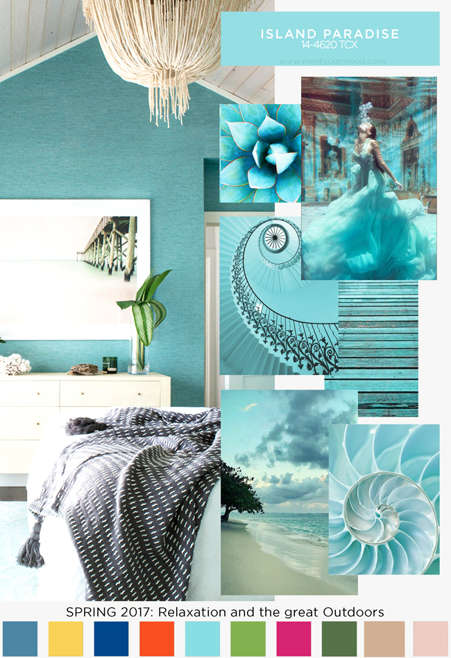
The PANTONE Fashion Color Report provides a comprehensive overview of fashion designers’ use of color in their spring 2017 collections, as seen during New York Fashion Week. From colors that are bright and vivid to those that convey a sense of earthiness, Pantone sees the top 10 colors for this spring as reminiscent of the hues that surround us in nature. Featuring the top 10 shades seen on the runway, the PANTONE Fashion Color Report is your essential color guide to the season. Continue Reading
Color Series, Outfit Combinations
pantone