
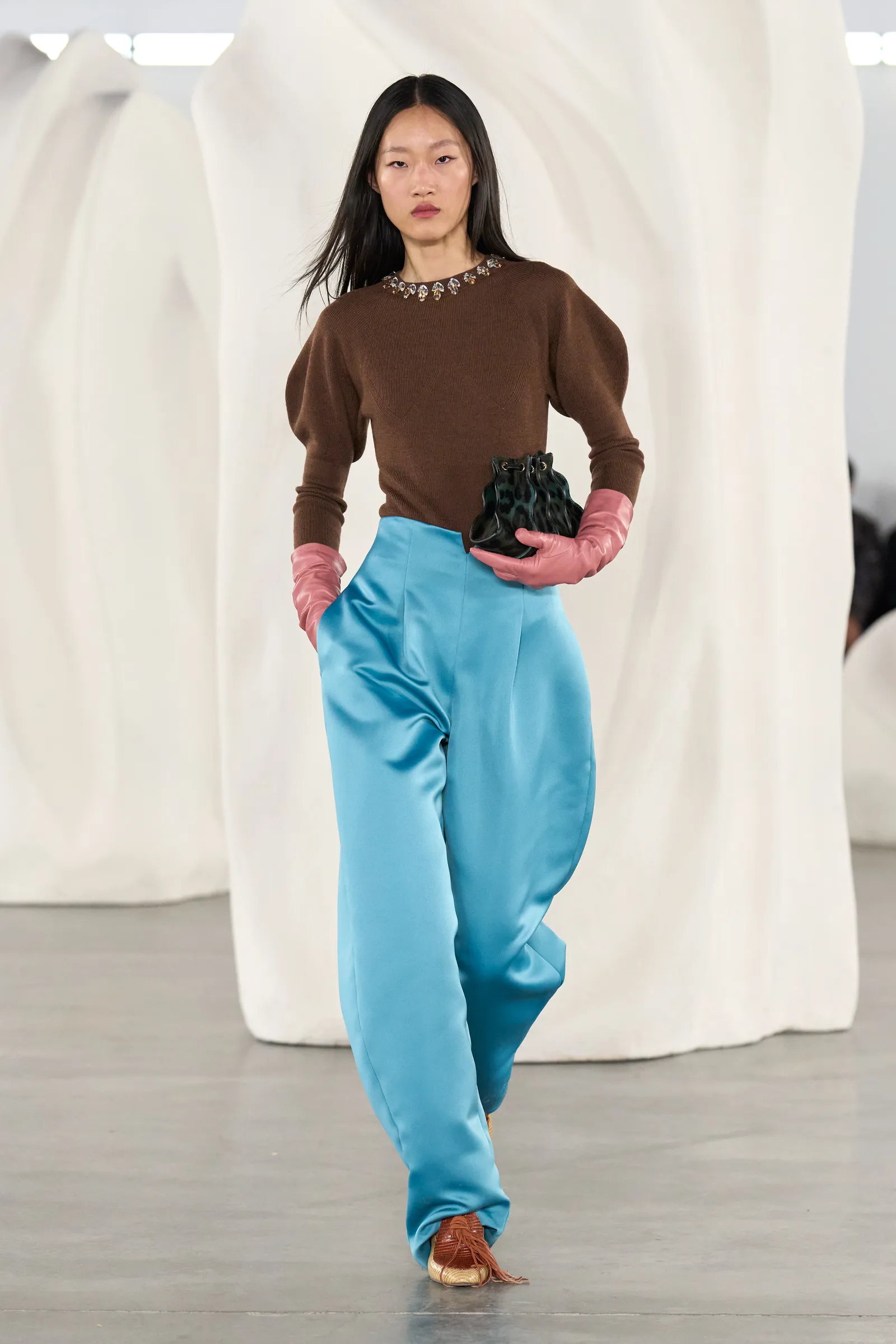
How to Combine the New Fall/Winter Fashion Colors Now
September has come and kids are back to school. But remember, Summer doesn’t end until the Fall equinox on September 22nd. During this time, I like to explore Fall colors to get in the mood. And then when we’re in the swing of Autumn with crisp, cool temperatures followed by the cold Winter, our clothing colors automatically change to match the natural world around us. (See my Style Tip on How to Dress With the Changing Seasons HERE.) No matter what the weather, I’m here today to help you find out how to combine the new Fall/Winter fashion colors now and later in bold and creative ways! Age doesn’t matter.
This is my annual update on the Fall/Winter trending colors.
There are traditional Autumn wardrobe colors and then there are those that the Pantone Color Institute has noted as trends on the Fashion Week runways. To find out about timeless classics, see my post “How to Use Colors That Will Get You in the Fall Spirit” HERE.
In this post, you will find out about the top ten New York Fashion Week (NYFW) Autumn/Winter 2026-2027 (A/W 2026/2027) trending colors identified by Pantone, as well as the five new core classic neutrals. Then I have a style tip for you. And finally, I will give you ways to combine these hues in your outfits.
You will be able to find variations of the colors from the New York collection in American stores easily as they stock up for Fall and Winter sales.
What Are the New Fall/Winter Fashion Colors?
Here is how Pantone explains the feelings behind the color choices for this season:
“By contrasting reassuring colors imbued with understated ease with vivid tones whose dynamic verve strikes a discordant note within an Autumn/Winter palette, the season highlights a reverence for authenticity while simultaneously capturing a desire to indulge in limitless creativity.”
Below are three categories of colors to use this Fall & Winter: the color of the year, the Autumn/Winter color palette and the new classic colors.
When choosing something to wear or buy, just shoot for something similar; it doesn’t have to be an exact match. The best thing to do is to choose the shade that flatters you the most.
The Color of the Year: Cloud Dancer

According to Pantone, Cloud Dancer is:
“…a lofty white that serves as a symbol of calming influence in a society rediscovering the value of quiet reflection. A billowy white imbued with serenity, Pantone Cloud Dancer encourages true relaxation and focus, allowing the mind to wander and creativity to breathe, making room for innovation.” Read the full story →
New York Fashion Week Autumn/Winter 2026-2027 Colors

This color palette provides us with a blend of colors that invigorate and refresh.
“Balancing minimalism with urban energy, NYFW Autumn/Winter 2026-2027 brings together the safe and the enticing to shape a new chromatic balance.” — Leatrice Eiseman, Executive Director of the Pantone Color Institute
Muted Clay

Muted Clay is a warm terracotta tone. It gives a sense of being casually rustic, grounded and enduring
Neptune Green

This is an aquatic green with a retro vibe that invigorates an Autumn/Winter palette with a modern feeling. It actually looks like a shade of turquoise.
Green Envy

Green Envy is a medium shade of green yellow. It looks like a light and bright olive green to me, but the color of the sweater above is just about a perfect match and is called pear. I see it as somewhat brownish and so it gives me a woodsy feel. What do you think?
This color is often described as bright, friendly and optimistic.
On the color wheel, it sits between adobe and a warm green. This color trio would go well worn together.
Arabian Spice

Pantone calls Arabian Spice “a piquant brown whose raw, earthy warmth displays a primal connection to nature.” They could probably just call it spice or rust if they weren’t being so poetic.
This spice color is between a golden brown and burgundy. An outfit in this trio of colors would look good.
Foxglove

A soft, muted pink infused with mauve, evocative of the romantic charm of a bygone era.
Pink for Fall! It mixes well with Autumn colors, such as burgundy and brown. It softens the harshness of the cold weather.
Festival Fuchsia

A deep, saturated magenta, Festival Fuchsia evokes a carnival spirit, celebrating freedom, vibrancy, and joy. Great for warming up and getting your energy going on cold days!
Red Mahogany

Red Mahogany is “a quietly indulgent red-toned brown whose rich depth envelops and allures.” Pull out your deep burgundy clothes and try those.
Acacia

Acacia is a yellow with a green tinge to tone it down for Autumn, yet it will brighten up the Winter. Try substituting chartreuse.
All Aboard

All aboard is a vibrant maritime blue reminiscent of sky and sea. It reminds me of a deep sky blue.
Burnt Olive

Burnt Olive is “a richly layered green tone imbued with subtle sophistication.” Your olive clothes and accessories are trending!
NYFW A/W 2026/2027 New Classics

Pantone also notes a classic color palette for each season. These are the basic neutral colors that you need all year round, year after year. They are seasonless shades that have lasting worth, so they are a good investment.
Following are the Pantone names for these colors. But you may as well just call them as they are: cream, tan, brown, gray and navy. These are pretty much the same colors Pantone features in their classic palette year after year, in varying shades.
If this year’s particular shades don’t flatter you, wear the shade that does.
These neutrals will backup and blend with the top ten seasonal shades shown in the section above this one.
Egret

Egret is a warm, creamy white. Last year’s white was pure.
Candied Ginger

Candied Ginger is “a smooth warm neutral that soothes and steadies.” Looks like tan. What do you think?
Toffee

Toffee is Pantone’s name for “a tasty brown displaying a timeless yet contemporary elegance.” Choose your favorite brown this season.
Underworld

Underworld is “a mid-tone gray whose strength and resilience provides a firm foundation.”
Poseidon

Pantone calls this shade of navy “a meditative ocean blue expressing confidence and credibility.”
How to Use the New Fall/Winter Fashion Colors
Style Tip:
The trick to looking good wearing seasonal colors is to combine them with your most flattering colors. If they are colors that are not flattering to your skin tone, you can use the seasonal colors in your accessories.
The Trending Colors That Are Best for Your Skin Tone
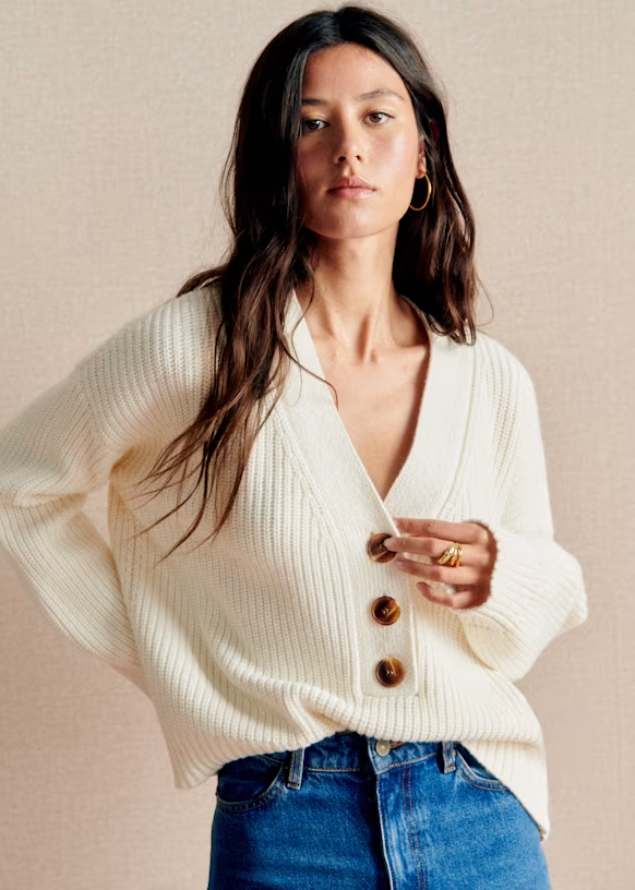
If you have golden tones in your skin, hair and/or eyes, your best colors are warm. If you have bluish undertones in your skin, your best colors are cool. For each trending color, note whether it is a cool or warm color. Some are neutral (called universal colors), which can be worn by everyone.
If you are not sure whether your coloring is warm or cool, bright or soft, light or deep, you might like to check out my post “Did You Know Colors Can Make You Look Amazing?” HERE. It contains a link to an online color consultant.
Ways to Combine the New Fall/Winter Colors
Below are some ways to combine the new fall/winter fashion colors in your wardrobe. You might also like to think about using some of these color combinations in your home.
The color combos below should inspire you to be more daring in mixing and matching outfits. And remember, older is bolder!
When combining two trending colors, balance the rest of your outfit with neutrals.
The first set of color combos is using the named Pantone colors from A/W 2026-2027.
The second set of color combos is using the named Pantone colors from this season’s classic palette. These classic colors work together and with any of the trending colors.
A/W 2026/2027 Suggested Color Combinations
Try some of the following color combinations based on the trending Autumn/Winter 2026 colors:

- All Aboard (sky blue) – Sky blue pairs well with neutral colors like white, gray, and beige for a clean look, as well as with complementary shades like coral and peach for added warmth. Cherry red (as in the photo above) brightens it up.
- Cloud Dancer (soft white) – Find out all about the color of the year, in my post on Cloud Dancer HERE.
- Muted Clay – pairs well with sandy beige, off-white, pastel pinks, muted greens, and deep tones like burgundy or navy for contrast.
- Neptune Green (turquoise) – pairs well with colors like soft whites, light grays, and muted earth tones, creating a calming and harmonious palette. Additionally, complementary colors such as coral or peach can provide a vibrant contrast.
- Green Envy – pairs well with neutral colors like white and gray, as well as rich colors like navy blue and cranberry. These combinations enhance the green’s vibrancy and create a harmonious look. Try it with clay/adobe or citron and other warm greens. You might like to accessorize with shades of bronze, brass or gold.
- Arabian Spice – pairs well with warm colors like deep reds including burgundy, rich oranges, and earthy browns. These colors complement its vibrant and exotic tone, creating a harmonious palette.

- Foxglove – Colors that pair well include white, black, light grey, navy, rose, beige, and muted purple. These combinations create a lively, modern, and expressive color palette.
- Festival Fuchsia – pairs well with colors like white, black, lime green, yellow, and soft gray. These combinations can create striking and vibrant looks suitable for various occasions.
- Red Mahogany – Colors that complement this deep burgundy include creamy white, black, anthracite, navy, taupe, warm beige, muted rose, and various shades of brown. These combinations create a warm and expressive color palette.
- Acacia – pairs well with colors like dark scarlet, light sky blue, and dusty pink, creating vibrant and appealing combinations. Additionally, it can be complemented by neutrals and other warm tones for a balanced look.
- Burnt Olive – Colors that complement Burnt Olive include white, light grey, navy, khaki, denim, warm beige, and brown tones. These combinations create a friendly and modern color palette. For more, see my post “What Colors Go Best With Olive for the Most Beautiful Outfits?” HERE.
A/W 2026/2027 Suggested Neutral Color Combinations
Wear any of these classic colors (Egret, Candied Ginger, Toffee, Underworld, Poseidon) as a monochrome look.
Or mix these neutrals together. This will make your outfits look expensive.
You could also pair any of these neutrals as a bottom with any of the trending colors as a top. This is an easy color combo and you’ll look modern and up-to-date. That’s a recipe for a youthful look!

- Toffee + warm neutrals like camel, taupe, beige and cream, as well as earthy tones like olive and navy. Additionally, it can be complemented by shades of burgundy and muted oranges for a stylish look.
- Egret (cream) – Colors that go well with cream include soft pastels like blush pink, light blue, and mint green, as well as richer tones like navy blue, deep green, and burgundy. These combinations create a warm and inviting palette. For a classic look, you can also combine cream with black or earthy colors like brown.
- Candied Ginger – pairs well with soft neutrals, warm earth tones, and muted greens. These combinations create a harmonious palette.
- Underworld (medium gray) – pairs well with analogous neutrals (colors next to it on the color wheel) like a soft, muted gray or a warm earthy gray. Or combine gray with complementary colors (opposite to it on the color wheel) that create contrast, such as warm tones like peach or coral.
- Poseidon – pairs well with soft sandy tones, vibrant coral, and various shades of teal and turquoise. These combinations create a calming and coastal aesthetic.
And There’s More!
Was this helpful for you to see the A/W 2026-27 colors with ideas on how to combine them? Do you have any favorite outfit combinations using these colors? Please let me know. Leave a reply below!
Like this post? You might also like to read:
- “How to Make Your Summer Outfits Professional for Fall“
- “How to Transform Your Outfits in the Fall“
- “Why Is Red the Most Brilliant Color Choice for Fall Fashion?”
Do you have a friend who would like this? Please use the Share buttons.
Never miss a post! Click “Subscribe” in the drop-down at top or fill in the blanks for the “Newsletter” at right. That would be a great help in supporting my blog. I would appreciate it very much!
Please support Your True Self Blog by visiting my Shop for Style Guides HERE. Or go to the top of this page and select the Shop tab.
Please follow Your True Self Blog on Facebook, Instagram, Pinterest, Twitter and Bloglovin.
Thank you for visiting Your True Self Blog!
Angie
Related posts:


Autumn/Winter Colors, Color, Color Combinations, Color Mixing, Color Tips, Color Trends, Fall Outfits, Fall/Winter, Fashion, pantone


I still think these are beautiful colors, and I really like the addition of the new classics. I’m pretty sure I have versions of all these colors in my closet! I love to combine colors based on the color wheel as well as some that clash because I like that effect sometimes. Thanks for the update, Angie!
https://marshainthemiddle.com/
This is a completely different blog post from last year based on the Autumn/Winter 2025-2026 Pantone fashion colors. When I do my annual Fall Color post, I still use the same headline. Maybe I should change that. Thanks for faithfully commenting. – XO, Angie
Oh, these colors are gorgeous! And, many of them are colors I can wear! I’m sure I have quite a few of them in my closet, but a girl needs a little updating, right? Thanks for sharing the colors as well as some tips for styling!
https://marshainthemiddle.com/
I’m in love with the universal teal gemstone color! It’s so much easier to get in the mood for Fall in late Summer by changing our wardrobe colors. Thanks for sharing your thoughts. XOXO
These are wonderful choices and great inspiration for fall colours to work into your style.https://www.bauchlefashion.com/2024/09/5-patent-designer-bags-that-are-perfect.html
Thanks for the nod!
Good to see a combination of warm and cool colours in the Pantone selection. It’s often not very easy to find the exact shades until the following year. Thanks for linking!
I agree, Gail! Thanks for the linkup . 😉
Oh my god! I loved that color wheel cardigan. Ordering now! 😍
I love when that happens! I’m so glad you found something perfect for you. Thanks for letting me know. XOXO, Angie
So, I still adore red and especially the Malbec Red suit!!
And red must be a classic fall color, right? As Malbec is a wine, it’s a lasting winter color choice as well. I’m glad you let me know your favorites! ;D
I’m not looking forward to fall, I love summer way to much. But I always get excited to see the fall collections. Love the warm colours.
I focus on the moment so, like you, I enjoy summer until the autumn equinox. But I am aware that Labor Day in the U.S. is celebrated as the last weekend of summer and people are feeling the approach of fall. I post the fall/winter colors just before fall when it’s still warm weather because just applying the palette to our summer outfits does bring on the excitement of the new season. On the equinox, I will begin to get serious about putting away summer clothes a little at a time to make room for cold-weather essentials. Thanks for visiting!